Proof and case notes
This method did not start as AI hype.
The Accidental Analyst comes from a book, training history, Tableau-era visual analysis work, enterprise analytics practice, and recurring field patterns from real business analysis.
Origin proof
The book came first. The AI layer came later.
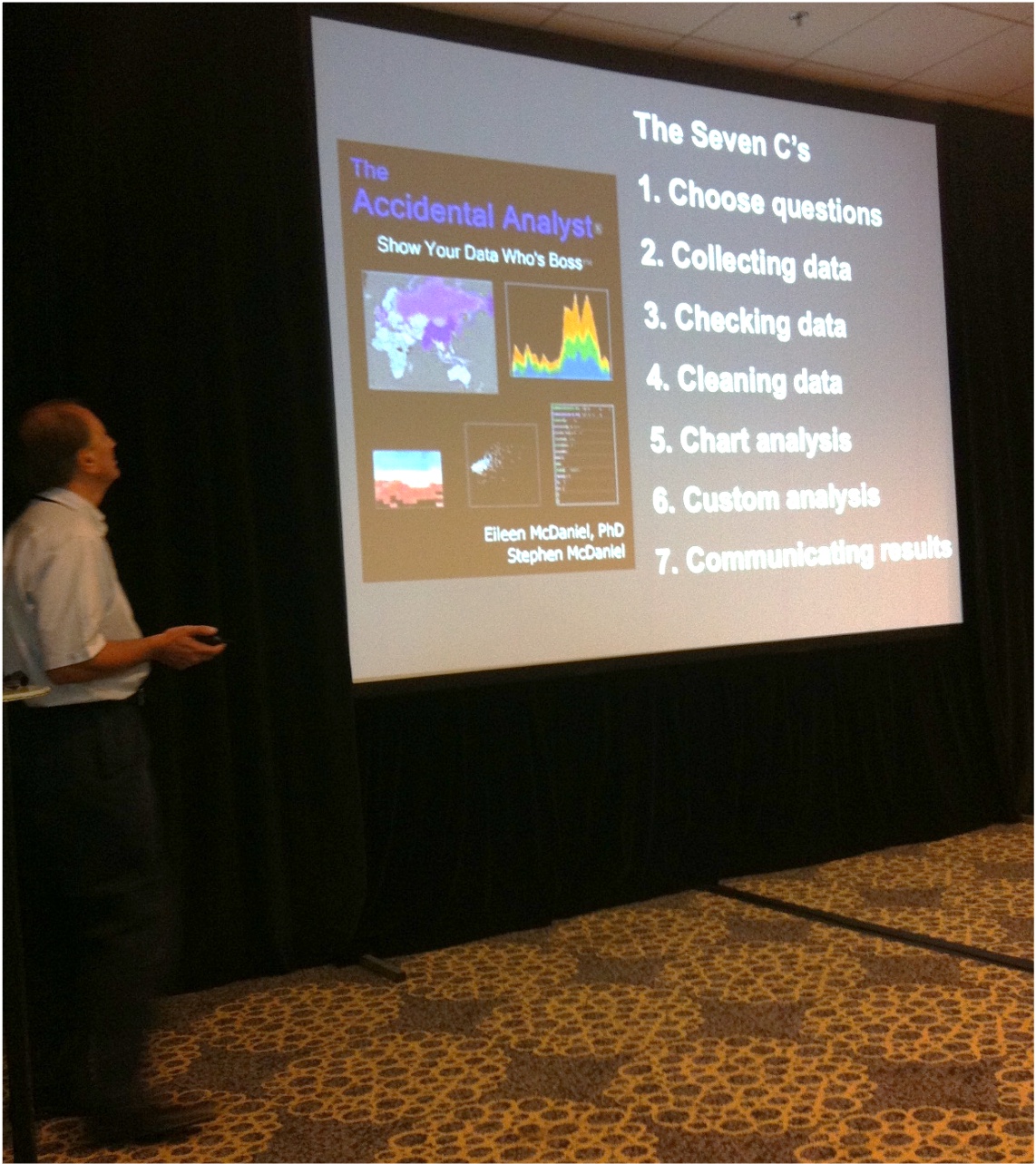
Eileen McDaniel, PhD, and Stephen McDaniel wrote The Accidental Analyst for people who found themselves responsible for serious analysis work without a clean method for doing it: practical guidance for becoming more effective, decision-ready analysts.
The current labs translate that same practical discipline into the AI era: clarify the question, check the data, clean the workflow, test the explanation, communicate the decision, and monitor what changes. The AI-era version solves the new problem: AI can generate outputs, but it cannot know which business question matters or which answer a leader can trust.
Credibility assets
Built from practical analytics work.
Books and teaching
The Accidental Analyst, Rapid Graphs with Tableau, and SAS For Dummies connect the brand to practical analyst education rather than abstract thought leadership.
Enterprise analytics
Stephen’s background spans Netflix, Tableau, Yahoo, SAS, Oracle, forecasting, BI, enterprise data, and analytics training.
Manager-ready analysis
The method is built for messy spreadsheets, dashboards, recurring reports, forecasts, and business reviews that need to become decisions.
Case-note patterns
The same failures repeat.
Clean ARR dashboards can still mislead
The failure mode is not ugly charts. It is metric logic that looks clean while overstating the story leaders think they are seeing.
LTV/CAC breaks when cohorts are blended
Averages can hide whether the newer customers are improving, deteriorating, or being subsidized by older cohorts.
Forecasts fail when assumptions are orphaned
The spreadsheet often survives after the business assumptions have gone stale, unowned, or politically convenient.
Cohort retention changes the decision
The right cohort view changes the argument from vague retention commentary to a decision about acquisition, pricing, onboarding, or account management.
Use the proof
Choose capability or workflow repair.
If the problem is analyst capability, start with a cohort. If one workflow is already painful and important, start with a Diagnostic or Sprint conversation.